Lighter or Darker Backsplash? Your Ultimate Guide to a Luxury Kitchen
Deciding on the relationship between your kitchen backsplash and countertop is a crucial step in creating a space that feels both beautiful and functional. You’re likely wondering if a lighter or darker backsplash is the key to achieving that high-end, luxurious look. The answer is that both can work wonders, but the secret lies in the execution and overall design harmony.

The backsplash serves as both a protective surface and a design focal point in any kitchen. Its color choice affects how light reflects throughout the space, influences perceived room size, and sets the overall mood. Many homeowners struggle with this decision because it involves coordinating multiple elements while maintaining a cohesive design vision.
Should the Backsplash Match the Countertop or Cabinets?
The question of whether your backsplash should coordinate with countertops or cabinets depends on your design goals. Matching the backsplash to countertops creates a seamless, monochromatic look that emphasizes continuity and can make smaller kitchens appear larger. This approach works particularly well with neutral palettes and minimalist designs.
Alternatively, matching the backsplash to cabinet colors creates visual cohesion in the upper portion of your kitchen, drawing the eye upward and making ceilings appear higher. This strategy is effective in kitchens with distinctive cabinet colors or finishes you want to emphasize.
A third approach involves using the backsplash as a transitional element that bridges the gap between countertops and cabinets. This method allows you to introduce complementary colors or patterns that tie the entire design together without strictly matching either element. Consider the 60-30-10 color rule: 60 percent dominant color, 30 percent secondary color, and 10 percent accent color for balanced visual appeal.
Backsplash and Countertop Color Relationships
The relationship between backsplash and countertop colors creates the foundation of your kitchen’s visual impact. High contrast combinations make bold statements and define distinct zones, while low contrast designs promote tranquility and spaciousness.
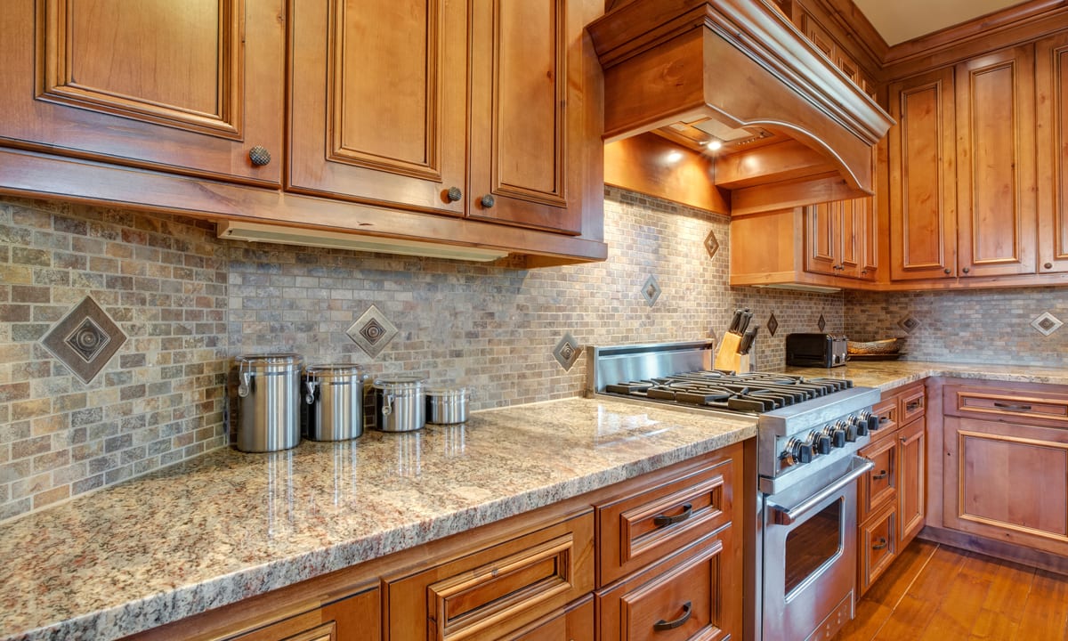
When working with patterned or veined countertops like granite or marble, consider whether you want the backsplash to compete for attention or provide a restful backdrop. Busy countertops often benefit from simpler backsplashes, while plain countertops can support more decorative tile work.
Texture also plays a crucial role. Glossy backsplashes reflect light and create energy, making them ideal for kitchens with limited natural light. Matte finishes absorb light and create a more subdued, sophisticated atmosphere. The interplay between countertop and backsplash textures adds depth and interest beyond color alone.
Lighter Backsplash with a Darker Countertop
Pairing a lighter backsplash with darker countertops is a classic design strategy that offers numerous advantages. Light-colored backsplashes reflect natural and artificial light, making kitchens feel brighter and more spacious. This combination works exceptionally well in kitchens with limited window space or northern exposure.
White, cream, light gray, or pale blue backsplashes create a clean backdrop that highlights darker countertop materials like black granite, deep brown quartz, or charcoal soapstone. This contrast draws attention to the countertop’s beauty while preventing the space from feeling too heavy or enclosed.
Lighter backsplashes also show less wear and water spots than darker options, making them practical choices for busy kitchens. However, grout lines may require more frequent cleaning to maintain their fresh appearance. Consider using epoxy grout or grout sealers to minimize maintenance.
Darker Backsplash with a Lighter Countertop
A darker backsplash paired with lighter countertops creates dramatic visual interest and anchors the design. This approach works beautifully in kitchens with abundant natural light, where the darker backsplash won’t make the space feel cave-like.
Deep colors like navy, charcoal, forest green, or black create striking focal points behind ranges or sinks. When combined with white, light gray, or beige countertops, these darker backsplashes provide grounding weight that prevents the kitchen from feeling too sterile or clinical.
Darker backsplashes hide splashes, stains, and minor imperfections better than lighter options, making them practical for cooking-intensive households. They also create a sense of intimacy and warmth, particularly when paired with warm-toned lighting. However, ensure adequate lighting to prevent the space from feeling too dark or oppressive.
A Step-by-Step Guide to Choosing Your Backsplash
Begin by assessing your existing elements. Identify your countertop color, cabinet finish, flooring, and appliance colors. Take photos in different lighting conditions to understand how colors shift throughout the day.
Next, gather samples of potential backsplash materials and view them in your actual kitchen space. Colors appear dramatically different under showroom lighting versus your home’s specific conditions. Place samples against your countertops and cabinets, observing them at different times of day.
Consider your kitchen’s size and natural light. Smaller kitchens generally benefit from lighter backsplashes that maximize brightness and create an illusion of space. Larger kitchens can accommodate darker, bolder choices without feeling cramped.
Think about your long-term plans. Trendy colors may date quickly, while classic neutrals remain timeless. If you plan to sell your home within a few years, opt for broadly appealing choices. If this is your forever home, feel free to express your personal style more boldly.
Test your color theory by creating a mood board with paint chips, material samples, and inspiration photos. This visual reference helps ensure all elements work harmoniously together. Don’t rush the decision—live with samples for at least a week before committing.
Finally, consult with a designer if you feel overwhelmed. Professional designers understand color theory, spatial relationships, and current trends, helping you avoid costly mistakes while achieving a sophisticated result.
Bringing Your Vision to Life
The choice between a lighter or darker backsplash ultimately depends on your personal preferences, existing kitchen elements, and lifestyle needs. Both approaches offer distinct advantages when executed thoughtfully. Consider how you use your kitchen, how much natural light it receives, and what atmosphere you want to create. By carefully evaluating these factors and following a systematic selection process, you’ll choose a backsplash that enhances your kitchen’s beauty and functionality for years to come.


